Thursday, July 5, 2012

28 days, 28 solo exhibitions
The Art Salon  New Orleans
Curated by 
Emily Farranto
Kathy Rodriguez
Natalie Sciortino-Rinehart


Curator's Note:
The One Series was a sequence of 28, one work, solo exhibitions. We hosted small, salon-style gatherings every evening of the 28 days. Spending a couple of hours with one work per night among an interested audience was an extraordinary experience. In a sense this process reminded me how to look at artwork, or at least how I want to look at it. I want to take some time with a work, refrain from judgement, open to being changed by it.      -Emily Farranto

Sunday, July 1, 2012


June 28
Kim Waale
Lullaby


Spiderwebs are beautiful. They are especially arresting when abandoned and covered in dew. Like rainbows, almost everyone agrees they are beautiful. But unlike rainbows, spiderwebs serve a function; they are traps. I suppose what makes spiderwebs so visually enticing is the complexity of the pattern and the fine-lined translucence of the material. They can also be admired for their brilliant engineering and yet they are temporary.

You could immediately identify this installtion as three large spiderwebs, but the material was unclear without closer inspection. Glass beads were strung on some fine, but irregular translucent material that was in fact made of plastic wrap spun on a drop spindle. Viewer after viewer asked, How long did this take? I don’t believe that this work necessarily took more time to make than a lot of other artworks and yet it seemed to solicit this question again and again. Like spiderwebs in nature, these webs seemed to represent time itself and labor. But unlike natural webs these served no function. Because of this they seem emblematic of the labor of art.

Why would someone create this? Why do we make art? This piece brings to mind questions about the practice and function of art, but it seemed to invite more associative readings than formal. The conversation drifted more naturally to biology than to other artists. I asked the artist, because it wasn’t easily identifiable to me, about precedent works. She mentioned a sculpture by Eva Hesse titled Right After at the Milwaukee Museum of art. I also found common ground in the work of Berndnaut Smilde, especially the cloud forms. Nature, but not. 

After the reception, and after we had revisited the space with a small group of people and talked for a while about the piece, I drove by the gallery. We had not cleaned up the glasses or wine bottles or put away the chairs. It was night and the lights inside were low. It was at this moment that the piece seemed fully realized to me––the two endeavors, creative and natural overlapping with us like in nature. Spider webs do look like some sort of measure of time, the radial strands like the hands of a clock. They represent time and what it has abandoned. I parked the car and looked in the window at this peculiar scene in the half-light: the circle of empty chairs, the debris, the drooping webs sparking overhead. I thought of the circular, lilting melody of the title, about passing an afternoon discussing art, these strange and pretty things we do before we’re gone. 


EF

Wednesday, June 27, 2012


June 27
Kendall Mingey
Idol


This was a statue of a horse. But then it wasn’t exactly a horse. Or this horse was a little off. This whole piece was a little off. It was fantastic. 


I cannot figure out why this piece was so satisfying. So I looked for images of bronze sculptures of horses. First of all this was not bronze; it was stainless steel. The base was spelt maple, a wonderful detail. Second, this work didn’t really look like the sculptures that came up in my image search. Its legs were stumpy. Its body looked more like a dog, some kind of pointer. There were balls but the penis seemed to be missing or extremely retracted. His anus was exaggerated. His lips were slightly human and curled like Billy Idol’s signature snarl. Its jaw line was exaggerated and in fact his face resembled testicles and a penis (see for yourself!). 


I am falling into straight description, I know. But every detail of this work delivered something. I don’t know what any of it meant. But it was funny and strange and I haven’t seen a work like it before.


EF


Tuesday, June 26, 2012

June 26
Nathalie Shepherd
Daisies Never Tell


There was an article by Jordan Kantor in the November 2004 issue of ARTFORUM called “The Tuymans Effect”. It named “…distinctively crude rendering, his chalky palette and limited chromatic range, his use of photographic and filmic sources and cropping techniques…” as some characteristics of the artist’s work and subsequently the work of some of his admirers.

I can see the influences in this the piece titled Daisies Never Tell. I see Tuymans of course and Marlene Dumas. In the installation approach I recognize Karen Kilimnick and Elizabeth Peyton. There is nothing wrong with building a vocabulary based on the work of established professionals. But I also believe that in every artist is the capacity for unique solutions and a voice that can be attributed to none other than the artist.

A writer and friend I admire very much once said, regarding influence—and I’m definitely paraphrasing here­­––to copy the writer you admire, to follow him to the edge of the pier and then push him in.

An artist I met only once but had a wonderful conversation with had moved from Istambul to New York. She said something like, as an artist you must leave your family. Then, she clarified that you did not have to become estranged. You just needed to get far enough to escape their expectations and limitations.

So I am thinking about parentage, not biologically but creatively. There were moments in this piece I started to see the distinctive voice of the artist. There were those odd and interesting canvases with rope pictograms. There was a small sort of aqua-colored portrait. Clearly the artist can paint. Then there were several canvases that were difficult to invest myself in because I felt that the artist was not truly invested in them. This artist, I guessed, is more sincere, more complex, and more unique in her perspective than some of the paintings indicate. 

I imagined that the creative parents of this artist say, Wilhelm Sasnal and Kaye Donachie (sharing Luc Tuymans as a recent ancestor), were present in the gallery. I wanted to approach them politely, thank them for all they have done and, on behalf of the artist, show them to the end of the pier.

EF

June 25
Lara Bullock
Invisible Cities

Performance Anxiety

Artwork that requires my participation often suffers from an uncooperative audience.

This piece didn’t ask a lot. The statement instructed me to use the paper fortune teller toy. Chose a letter: N-O-L or A. Choose a number. Lift a flap to find a word or “impression." I found the word “ETOUFFEE”. What does the impression make you think of or remind you of? The instruction sheet asked. Record your story/recollection in the diary provided. I wrote a page in the diary saying something to the effect that Ignatius (a nearby restaurant) had good etouffee and that they were on the verge of getting their liquor license for four years.

The part that suffered from my resistance was the final instruction to discuss this with others in the gallery. I didn’t want to talk about etouffee. I did not want to talk about Mardi Gras, or Hurricane Katrina either. In New Orleans there are plenty of opportunities to talk about our city. I wanted to talk about art. I tried to talk about this artrwork but it was difficult—maybe because of my own poor performance. 


EF

Monday, June 25, 2012

June 24
Eva Champagne
Emerge from Concealment 


Concealed Preferences

Biology is amazing. And sometimes a little icky. This piece, a sequence of four loaf-like ceramic forms, brought to mind ocean life, plants, or mushrooms. They also recalled the body, microscopic views of tumors or cells.

They walked the line between alluring and repulsive. At first I favored the two that were asymmetrical, finding them more interesting. The symmetry, glazing and the decorative layout on the others were, I thought, too neutralizing of that tension between attraction and repulsion. I concluded too quickly that this contrast was the point. The ones that were ickier were more difficult, and difficult was more interesting. Then, my eye, without my permission, started straying to the ones I had decided were inferior.

Does the level of difficulty determine the worth of an artwork? Is it better if it is more difficult, slower to be liked? Slower to be liked by whom? Is something decorative more easily dismissed by contemporary art viewers? By me maybe. But in this case the decorative element might have been the more subversive. Why do we value subversion? I was falling into a rabbit hole with this work.

I guess that when I look at a work I want to be attracted. I want that attraction drawn out. I want to be interested, intellectually. I want that interest drawn out. I want artwork to question me and question itself and the established order of aesthetics. But as soon I lay this all down I want to be proven wrong. 

EF

June 23
Patty Zuver
Island Jetty


This piece was a pinhole photograph printed digitally on Arches.  In minimal language it suggested a shoreline, a couple of subtle waves, a jetty. I was drawn to the waves, the way they were paused. The photograph was nostalgic, romantic, and personal. I wanted to be close to it, enter it. But it was framed in painted wood and cardboard and Plexiglas so that there were more presentation elements than pictorial. The framing kept me on the gallery side of the glass.

Other viewers and I discussed the process of converting a pinhole photograph to a digital print and framing it. Someone presented this possibility: a pinhole photograph is the unique result of using a handmade camera with a little hole and no lens. The artist has taken a pinhole photograph, then cropped or cleaned it up, printed it digitally, and then matted and framed it. Maybe the artist was visibly abandoning the most basic analog process for digitalization and then further burying it in presentation. I don’t know–– I don’t think this work is asking to be read as conceptual.

Another point on the subject of presentation was brought up by different artist: We have to protect and preserve our work, especially when it is being shipped and installed. Thus the framing.

But I am left with what I see. This photograph has much in common in the artist’s work as I know it: nostalgic, quiet, utilizing a kind of pictorial reduction. I don’t think this piece is asking for a lot of dissection. It simply offers a moment, a tone, a view to experience. I just wished for more access to it.


EF

Sunday, June 24, 2012


June 22
Sarah Marshall
Lagniappe


A fish, a fossil, a bubble or pearl. Lagniappe: a little something extra, a little something for free. Lithography is a process of oil and water.


I saw a story of a marine catastrophe. I saw oily fingerprints. I saw an oyster’s pearl in the mouth of a mutated fish. Or I might have seen a moment of evolution, a fish learning to fly, a pearl of wisdom. A little something extra. Or––


This was a wonderfully complex image, full of marks both readable and abstract. They were varied but in accord. I appreciated the quiet of this piece, its resistance to definition. I have thought many times recently that the unique gift of visual arts is the potential to create silence or to encourage stillness in the viewer. I don’t feel like talking much about it, which is maybe another gift of this piece. (If you only see it only online you will miss a lot.)

EF

Friday, June 22, 2012


June 21
David Politzer
Restless


Restless Arts


I watched this video for total of about an hour or an hour and a half. But I am looking at it again online. So I am writing this in the present tense.

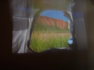
A series of American vistas framed by grey and blue nylon. Like Bernd and Hilla Becher you see the variation because of what stays the same. What stays the same is the opening of the tent, a sort of rounded square shape, irregular on one side where the door flap is neatly tied. There are also two small rectangular windows in the two top corners. After a few times through the almost seven minute loop you begin to watch the landscape change through these subservient frames. Many of the views  are impressive. National Parks of the West maybe.  The vistas are so sublime and the tent so…sporty. These two visual elements are share the frame but are never reconciled exactly. I am reminded of the Gore-Tex-clad portraits of Karel Funk, the natural and synthetic butting up against each other.

The first several locations are likely camping spots: flat, dry, high ground. Then, the tent hovers just above a flowing river; we know this is a departure from the reality of camping. The tone is not quite serious, or not quite taking itself seriously. A sign reads “NO camping beyond this point” then the tent faces a chain link fence that guards a drop off (No camping beyond this point). A dog looks into the tent. There is a man with a metal detector on the beach. These shots are somehow funny.

When the tent begins to drag backward we know for sure we have departed from any likely camping scenario. This becomes more than a sequence of views from a pitched tent. It is implausible (you don’t usually move a tent more than a few feet this way) It also resembles the view of a person being held under the arms and dragged. It’s a helpless or wounded posture. Or it’s the point of view of an inanimate object.

At one point the tent swivels abruptly, correcting the view from one framed tree to two. At this moment the opening of the tent most resembles the viewfinder of a video camera on a tripod. Does the video address camping or making art? Are they related?  Are they parallel? Is it making an analogy? The camper sets up the tent, chooses the direction it faces conscious of the light, the view. The artist sets up the lens with some of the same criteria. But the element of dragging the view proposes a puzzle I cant quite complete. Which is probably good.

And Restless. What is the restlessness named in the title? Do people camp out of restlessness? I don’t think so, even if they change locations frequently. Maybe this is the restlessness that propels a person who enjoys both camping and recording but is unable to settle in and enjoy either process. Or maybe, and most interestingly, restlessness is not a driving force but a dragging force that moves it all impatiently in the opposite direction of the ideal view.


EF
June 20
Sarah McCoubrey
Hut


Anecdote of a Hut

In the center of this painting there was a pink shed, or hut, as it was referred to in the title.  However, my eyes did not rest long on this title passage of the painting.

I looked at the sky because it was subtle and gorgeous and occupied slightly more than half the picture plane. I looked at the dark mound of earth because of its strange shape, contrasting tone, and its position in the foreground. The few trees articulated with improbably dark singular brush strokes called my attention to them, especially those creating a net-like pattern on the left edge. Then, a small, red rectangular shape in the lower right corner, repeatedly drew my attention to its incongruity. And I wanted to look into the vague and strangely lit distance because I always seek this point in landscape paintings.

My gaze did not rest on the hut. In fact, it seemed to bump into the hut on its way to other passages of the painting. The hut actually seemed to block passage beyond it. I found myself  wondering about the focal point or focal points.  And I found myself thinking about Wallace Steven’s Anecdote of a Jar.

I placed a jar in Tennessee, 

And round it was, upon a hill.
It made the slovenly wilderness 

Surround that hill.

The gaze wouldn't linger on the jar with the complex wilderness around. Mine wouldn't rest on the hut.


The sky, the distance and the hut are described without the slightly frantic texture of the rest of the painting. And its strange that a scene so still should also be so agitated, as if the viewer/painter cannot stop focusing on individual blades of grass or branches or leaves against the notion of a singular focus.

One more thing I wanted to think about was the format. This landscape painting was not horizontal (the format most common to the genre), and it was not quite square (Klimt painted square landscapes but I cannot thing of many others); it was vertical by one inch. I had no idea what to make of this but I think that it contributed to the slightly uneasy experience of looking at the painting for an hour. At first I thought I knew what I was looking at but I became less and less sure.

Incidentally, the painting arrived nearly an hour into the two hours it was scheduled to be on view. It was rushed to the gallery, unpacked, hung, lit, and adjusted in front of its audience. It was something to see this small painting become the focal point, making the gallery surround it.


EF

Tuesday, June 19, 2012


June 19
Jill Olm
Quiet Disturbance


After Sound


I was looking at this drawing a while when someone said the word “fizzy” regarding the multitude of tiny circles concentrated on the drawing’s right side. That’s right, I thought, it’s sonic. This drawing is like sound. But how was it achieving this effect? Though it was non-representational, my first association after seeing a digital reproduction was The Blue Angels, the US Navy’s flying acrobatic team. If you have ever heard jets training overhead, you know the noise. I imagined a jet’s roar from falling jet-like forms on the left and a kind of popping from the hundreds of circles. Then I remembered the title. Ah yes...

The medium appeared to be ballpoint pen and marker on what looked like Bristol board. I wanted to see the surface of this drawing, which was behind glass. Even more, I wanted to see the drawing without the black frame. White maybe? I imagine that without the frame the effect of falling and floating and the impression of sound and movement, would be more effective.

How to hang a drawing. This is always a problem to solve. Every solution presents a condition that becomes part of the work. In this case the use of non-precious media and the visual imposition on the drawing by the frame would argue for the drawing to be hung directly on the wall. I am harping on this only because after thirty minutes in front of the drawing the piece became more and more optically effective, seemed to expand. Seemed to make noise. It had a huge wall onto which its interesting afterimage could be projected. Part of the afterimage was that rectangle holding it back, holding in the sound that wanted to reverberate.


EF

June 18
Katie McMullin
The Writer


Paint can provide an excellent vocabulary for addressing the strain of our physical existence.The passages of this painting I enjoyed looking at the most were those where I sensed a struggle between the artist, the paint, and the subject. There were intersections where the strain of the subject (hunched over, working with out-dated technology, looking away from the task he is engaged in) and the strain of the painter (articulating an arm, a hand) met and these were, for me, the most engaging passages in the work. Paintings, especially portraits, remind us that we live in the flesh.


EF

Monday, June 18, 2012


June 17
Claudia Cannizzaro
Flags of Whose Fathers


The piece was comprised of nine black and white hand-painted American flags on which the artist has embroidered passages of the behavior management manual for prisoners at Guantanimo Bay.


The aspect of this work that I wanted most to dwell on was the stitched lettering. The labor of this task was the heart of the artist’s vigil for these prisoners. This gesture must have become tedious to pursue. But she did. We can see that time passed and the artist approached the task in different states of mind; sometimes the stitching is tight and the lettering small, other times the letters are more crudely and loosely rendered.


I have a hard time with overtly political art. Politics is something I want to engage in with reason. The history of political art is rife with propaganda and not always for the good guys. I go to the visual arts for something else. I want ambiguity. I want tenderness. I want a language that disrupts clarity. Some artists, like Francis Alÿs, manage to apply small human gestures to huge political situations. I do not really want to engage the flags (that tired, and loaded symbol) and the fact that the passages are selected from the manual, well, this editing suggested to me—against what I believe to be true––that taken as a whole and taken in context, the manual is not so bad.


For me, the power in this piece is in the small, human gesture of the stitching. This act alone is quiet, unique, sustained. It is human and effective. A woman sewing (or writing, like Akhmatova) for a man (or in this case men) in political prison is an old but always poignant story. I also think of the line from Allan Ginsberg’s Howl, which is repeated several times: “I am with you in Rockland.” I believe the artist is saying this: in all of the humiliations and absurdities and institutionalized discomforts, I am with you.


EF


June 16 
Nicole Zehr
Untitled


To look, to see, to glimpse, to glance, to notice, to observe. The experience of sight is remarkable. This of course is an understatement. It has to be because it is a statement and how could language relate the experience of one of the senses?
This little painting, smaller than a sheet of typing paper, held my attention for two hours. My eyes never grew tired of looking at it because it continued to yield a changing optical experience. The background would push forward then seem to recede. I say background yet his is an abstract painting. Until its not. There is the suggestion of space here, there is distance, more distant distance. There is a horizon. There is the impression of a centered form.  There is a form in front of this one though it seems to be moving. A wave, maybe?

I see a boat, a ship. And then, I can’t not see this form as a ship, this painting as nautical. But it continues to change. There is a push and movement of atmosphere. There is the light from the farthest distance pushing through to the surface of the painting. There is almost the impression of wave-like motion. How can this be as there is not a recognizable form in the painting?

When I saw paintings by John Constable in London I was overtaken by their strangeness. It was not the just image but the way the surface of the painting seem to change as I looked at it, change in the corner of my eye as I looked away. This almost created the sensation of the drastic weather that the painting portrayed. Or Corot, the way the trees in his paintings always seem to be moving. The light patches of paint on the surfaces of these paintings feel like sunlight passing through leaves on a windy day. Or Turner whose land and seascapes more abstract than representational. They seem to manufacture light.

This painting uses an abstract vocabulary to render (as I see it) light, space, movement, and atmosphere. This painting gives me the easy satisfaction of looking at a landscape painting and the uneasiness of not knowing what I see.

I must also mention the wonderful, irregular, edges of this painting. You have to see them. They render this painting an object as well as an image. There is not an inch of this painting that is not disorienting and wonderful. I have written this in the present tense because the two hour exhibition of this painting is over but I can’t stop looking at it..

EF
June 15
Edgar Smith
Opportunity to Milltown, Milltown to Opportunity


Missed Opportunity

Part of the point and pleasure of this series of exhibitions is engage in sustained looking. I arrived at this exhibition late, with only 20 minutes or so to see the work. The conversation had also run it’s course and appeared to be winding down. I asked the person who was deinstalling to email  copies of the statement and two other pages that were included on the wall of the piece. The piece was complicated. It required an effort of reading and decoding. When I received the pdf of the statement text could not be enlarged enough to read without pixilating. In other words, I missed the piece. It was over. There was no way I could, from looking at the photographs I had taken and reading the statement (if I could have read the statement) have had anything but an remote and intellectual experience of the work.

Last night after a long day I sat down with last month’s issue of ARTFORUM.  As I flipped through the pages, not really reading anything, I realized how often we approach artwork peripherally and intellectually. If you are not in the room with a piece of visual art it cannot truly reach you. I wanted to write that and see if I believed this statement. When we look at ARTFORUM, see work online, salivate over gorgeous artist books or catalogues we are in a way sustained but not nourished. If you are a student or if you teach, if you don’t live in a location with a profusion of galleries and museums, you seek art in reproductions because you are hungry for it. But I am considering this possibility: If we accept, even subconsciously, that looking at ARTFORUM is engaging in art we miss the real experience of looking at art, which necessarily happens live and in person and with time.

As long as I am not living there I will miss the museums of New York. I miss the option of seeing work at David Zwirner each month. I miss the big exhibitions and the small shows. But I am beginning to think that I should not try to fill the void with anything other than artwork, real artwork, live and in the flesh.

I am sorry I missed the Edgar Smith show.

Friday, June 15, 2012


June 14
Joe Andoe
Empire State Building (Red)

New York Stories


When I was teaching at a two different schools in upstate New York I had two distinct student populations. At the university, my students had come from all over but many were from downstate New York including the city. The majority of students at the liberal arts college were from rural areas in upstate New York and if I remember correctly one or two had ever been to New York City. On the morning of September 11, 2001 and the day after I met with both classes in the wake of that day’s infamous events. The reaction of the students at the college was remote compared to the university students who knew the World Trade Center, had a sense of its scale, a sense of location and in some cases, an attachment to it. It was almost as if the students who were familiar with the towers more quickly understood the magnitude of those events. The students who had no prior knowledge of them were equipped only with TV image of the tiny parallel lines issuing a cloud of smoke. Buildings where they belong. Buildings as images removed from their surroundings.

It was interesting to sit in a gallery in New Orleans and look at an image of the Empire State Building. I had seen this painting before the exhibition, I had looked at the title, I know the biography of the artist, and I used to live in New York and not many other cities. When I think of towers I don’t think of Toronto or Cleveland or Tokyo. Therefore, I knew that this was the top of the Empire State Building. Other viewers saw the top of the space needle. One person saw a giant robot finger. In other words, this was an abstract image. The identifiable forms that emerge from an abstract image have everything to do with our perspective.

Speaking of perspective, someone pointed out that the perspective seemed to be directly across from and at the same height as the tower. I knew that the view painted represented the view from the artist’s apartment in the Chelsea Hotel which is much lower. And speaking of perspective, there were artists and writers at the exhbition. After sitting a while in front of the painting, after a discussion about the Empire State Building, the painters began to read the material, the method. The writers began to think more about the point of view, the person who held the point of view, the setting, the story.

As for method, the stretched linen was primed in gesso then covered with cadmium red. The image was drawn, wiped into the paint revealing the stained gesso underneath. There weren’t brushstrokes or a wide palette or a complicated composition to decode. We had an image, possibly abstract until we read the title. The artist was not asking us to engage in a long conversation about method. He was positioning us in front of an icon. The icon as it appeared in his own story,

Speaking of stories we had on hand a copy of the artist’s memoir, Jubilee City: A Memoir at Full Speed. More than a couple of us had read the book and so we could not help but project these stories onto the painting. I had also brought a catalogue of some of the artist’s other work, mostly horses, also painted in monochrome and similarly devoid of background, or to put it another way, inlaid on a background that at times nearly swallows the image.

What does it mean to paint a building without its right angles and straight lines? You take something enormous, iconic, belonging to everyone’s imagination and you trace its image into paint. This renders the icon your own.  And what role do the stories and the artist's own visual record play in the reading of the present work? Maybe this building and the horses and the stories rendered a quotidian vocabulary are all part of one story. Individually, there may not be enough vocabulary or artistry or intention to pin down the meaning or motive of this single painting of a building. But seen as part of a whole, we see a life: one person, one perspective telling one set of stories.